Few topics in photography are as important – and as personal – as the composition that you choose. Composition has the power to convey exactly what you want to say with a photograph, guiding a viewer’s eye seamlessly across the frame. It has been called, with good reason, the strongest way of seeing. This article revisits some previous Photography Life articles on composition, covering the most important elements and discussing how they relate to one another.
NIKON D7000 + 24mm f/1.4 @ 24mm, ISO 100, 1/1600, f/1.4
1) The Definition of Composition
At its most basic, composition is a relatively easy topic to understand in photography. Each time that you take a photograph, you must make conscious decisions as to which items you want to include. And, even more importantly, you must decide how to arrange the objects that are in your image. So, composition is nothing more than consciously arranging the objects in your photographs; any more complex definition just adds confusion for the sake of adding confusion.
Of course, as easy as it is to define the word “composition,” it can be remarkably tough to implement successfully. A strong composition, for example, is more than just a happenstance arrangement of objects. Instead, it brings meaning to your photographs, making them more important than they otherwise would be. A shadow is no longer a shadow; it is a line that leads to a person’s face – and the person is looking at a pot of flowers, which is the same color as a painting hung in the background. Your composition can tell a story, and it can thread together several objects that otherwise would be unrelated. The ultimate goal of a successful composition is to elevate the meaning of an image.
If you are interested to read more about the definition of composition, including fields other than photography, you can read our article, “What is Composition in Photography?”
NIKON D7000 + 24mm f/1.4 @ 24mm, ISO 360, 1/50, f/1.4
2) Visualization in Photography
The first step to creating a successful photograph takes place before you click the shutter: visualization. This is the concept of seeing the image in your mind’s eye, then asking yourself exactly which changes you are trying to make.
Visualization is all about questioning your photographic decisions. Are you focusing on the right subject, or should you search for something else? Which emotions do you want the image to convey (i.e., dark and ominous, or vibrant and happy)? After the photograph has been fully post-processed, how exactly will it look, whether in print or on screen?
The importance of visualization cannot be overstated, although many photographers do not initially realize its true value. Visualization is the planning behind a good photograph – an attempt to understand exactly how an image will look even before you take the photo. As you may expect, visualization is a crucial component of every genre of art. Even when looking at nothing but marble, sculptors plan exactly how their statues will appear. Painters plan what to create well before picking up their brush. Even abstract or experimental artists have an idea in mind before creating their pieces. Photography should be no different; your images will improve tremendously if you spend time working on visualization.
Photography Life writer Rick Keller has covered visualization in photography in several articles, which are important reads for anyone who wants to learn more about this crucial topic: “Construction of a Photograph: The Process of Visualization,” “Visualization: The Hunt for Light,” and “Visualization and Film Photography.”

NIKON D800E + 105mm f/2.8 @ 105mm, ISO 800, 1/800, f/2.8
While taking photos at the Jökulsárlón lagoon, I saw a few Arctic terns fly in front of a nearby iceberg. At the time, I didn’t have my camera set to take wildlife photos, but I knew that this would be an interesting shot. I changed my settings, found the perfect iceberg for a background, and waited. A few minutes later, a tern flew exactly where I wanted. This image would not have existed without visualization.
3) Leading the Eye
You cannot predict the exact path of a viewer’s eye through your photographs, but you do have the ability to nudge it towards one object or another. Do you want your viewers to pay more attention to the mountains in the background? What about someone’s hat, or the way that a palm tree bends across the beach?
One of the most notable ways to lead your viewer’s eye is simply to include a line spanning part of your composition. These are sometimes called leading lines, but even that is a bit of a special case. Typical “leading lines” extend from a landscape’s foreground to its background, guiding the viewer farther into the scene.

COOLPIX A @ 18.5mm, ISO 500, 1/1000, f/2.8
However, other lines can guide your viewer’s eye just as easily. Imagine a stem or a blade of grass stretching across your image; although it is not a “leading line” by the foreground-background definition, it certainly provides a path for a viewer’s eye to follow. The same is true for any line across an image, from the outline of a mountain to the curl of an ocean wave.
NIKON D800E + 105mm f/2.8 @ 105mm, ISO 100, 1/640, f/3.5
Along with lines, there are other noteworthy ways to lead a viewer’s eye from point to point in a photograph. At its heart, everything about composition is rooted in the way that we see the world. If an object is bright, contrasty, and vivid, it certainly attracts our attention. The same is true for people’s eyes and faces. So, as you may expect, the same items draw our attention in photographs.
You won’t always be able to use this to your advantage, of course. If your subject is a dark object in front of a vivid background, for example, you can’t necessarily focus on a completely different scene. However, you may be able to modify your image slightly, shooting the same subject in front of a cleaner background. Or, in post-production, you may be able to brighten the subject and decrease the saturation of your background. Even if you can’t change every aspect of an image, you can still use these principles to your advantage.
For more information about leading your viewer’s eye, consider reading these two articles: “Creating and Using Leading Lines” and “Leading the Eye.”

NIKON D7000 + 24mm f/1.4 @ 24mm, ISO 100, 1/4, f/7.1
Did you notice the single orange light in this photo? The nearby silhouette and the skyscraper help lead your eye in that direction. Plus, the light is relatively bright and contrasty, which naturally attracts attention.
4) The Rule of Thirds?
Perhaps the best-known element of composition is the rule of thirds, a particular method that some photographers use to frame their images. Essentially, the rule of thirds divides a photograph into nine parts, as shown below. The dividing lines themselves – and, particularly, the four points of intersection – are said to be powerful locations within a photograph. If you place your main subject at any of these four points, some photographers believe that your photos will be noticeably more powerful:

Here is an example photograph which follows the rule of thirds. Note the placement of the sea stacks and the horizon, both of which are along the grid of thirds:
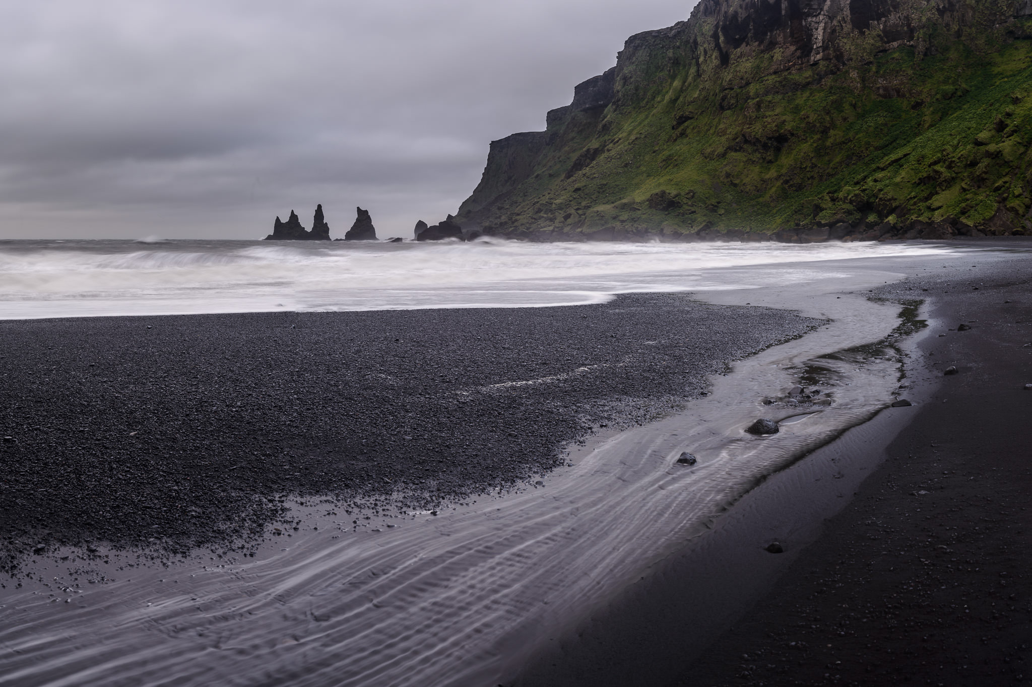
NIKON D800E + 50mm f/1.4 @ 50mm, ISO 100, 1/1, f/16.0
Of course, there are some photographers who see the rule of thirds as a generally useless tool. There are others – perhaps more – who think that it is important for beginners, but overly simplistic for advanced photographers. And then there are some who embrace it wholeheartedly, only avoiding the rule of thirds for a rare few images (such as mirrored reflections or abstract subjects). Whichever category you fit, be careful not to ignore a good composition in favor of fitting an arbitrary rule.
Indeed, my personal opinion is that it is hardly worth mentioning in the first place, although I included it here because I understand that most photographers will disagree. If you would like to learn more about the rule of thirds – and the possible exaggeration of its importance – you can read two of our articles for further information: “The Rule of Thirds” and “The Myth of the Rule of Thirds.”
NIKON D7000 + 24mm f/1.4 @ 24mm, ISO 800, 1/30, f/1.4
Although I could have taken the photograph above using the rule of thirds, it would have weakened the impact of this dramatic scene. Instead, by framing the Eiffel Tower as I did, I was able to emphasize the symmetry of the cityscape.
5) Balance
Rather than the rule of thirds, I tend to compose my photographs with the idea of balance in mind. Many other photographers are similar. When a photograph is completely balanced, its left and right halves have equal levels of visual weight.
So, what is visual weight? The answer is quite simple – visual weight is what attracts a viewer’s attention. As briefly mentioned in the “Leading the Eye” section, some of the main items with strong visual weight are as follows:
- Areas of contrast
- Items that are in focus (especially if most of the photo is not)
- Bright spots
- Saturated items
- Warm (red/yellow) colors
- Large items
- People and, to a lesser extent, animals
- The eyes of your subject
- The direction that your subject is looking (even if it is an empty space, it gains visual weight because viewers will want to look the same direction as the subject)
There are other items with visual weight, of course, but these tend to be the most significant.
To see whether a photograph is balanced, imagine placing it upon a fulcrum. If one half has more visual weight, your photograph will lean to one side or the other. Note that the left-right division is the only division that matters to a photo’s balance. A photograph can have every subject along the bottom, yet still balance perfectly.

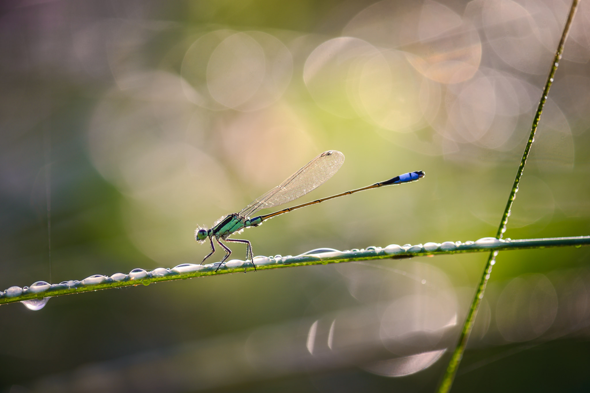
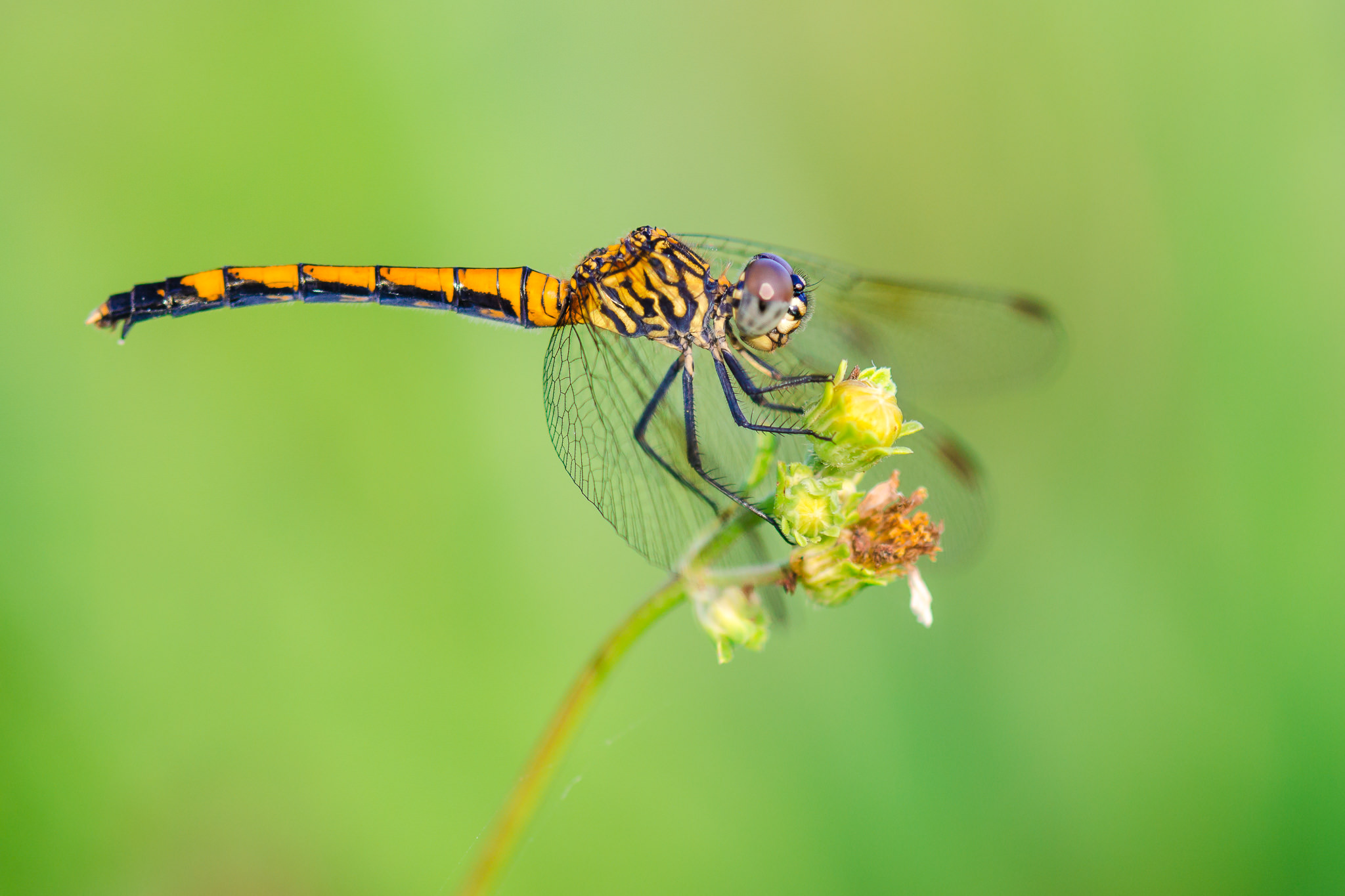
An example of a simple photograph that employs balance is below. There are two important subjects in this image – the dragonfly and the blade of grass – and both are placed equidistant from the center of the frame. This means that the image is balanced.

NIKON D800E + 105mm f/2.8 @ 105mm, ISO 1400, 1/800, f/2.8
Balance, however, does not always mean that two separate subjects must be the same distance from the center of an image. Consider, for example, a photograph with one important subject, and another that attracts significantly less attention. If the primary subject is placed near the center of the image, while the secondary subject is placed near an edge, the photograph can still be balanced. Or, if you are photographing an abstract scene without any areas of interest, the image may be balanced no matter where you point your lens.
At the same time, not all photographs must have perfect balance. Sometimes, to add tension to a scene, imbalance is actually desired. This is often true for war and documentary photographers, who may try to avoid a pleasing, “ideal” composition. In fact, imbalanced photos can be a part of any genre of photography. If you want to show the tension and drama in a landscape, an imbalanced photo could be the perfect tool. Take a look at the photograph below, for example, which is a bit imbalanced (heavy on the left-hand side):

NIKON D800E + 105mm f/2.8 @ 105mm, ISO 360, 1/80, f/2.8
Balance is a complex and sometimes subjective topic, but it has the potential to improve your images significantly. If you would like to read more, I recommend reading our longer article about all the uses of balance in photography.
6) Simplicity
One of the best ways to improve your photographs is to focus on simplicity. For example, if you are a beginner, it helps to search for the simplest possible scenes to photograph in the first place. Typically, it is easier to take a good photograph at a beach than in the heart of a rainforest – assuming that both locations are relatively interesting – since the beach is a much simpler scene.
However, another side of simplicity is more relevant to the majority of your images, since it is independent of the scene that you photograph: excluding the useless details of your images. Take a look at the photos below for a particularly clear example. This is one of the first photos I took during a macro photography expedition:

NIKON D7000 + 105mm f/2.8 @ 105mm, ISO 640, 1/400, f/5.0
A few minutes later, I took this photograph:
NIKON D7000 + 105mm f/2.8 @ 105mm, ISO 280, 1/400, f/4.0
Most people will agree that the second photograph is a stronger photo than the first. Why is that? Both images have a similar subject and composition; even the dragonflies’ poses are almost identical! Yet, the images are decidedly different in quality.
The main difference between these two photographs is that the second one is far simpler than the first. The background is clearly better in the second photo; it is a clear, uniform shade of green. This helps the dragonfly pop out more strongly from its background. At the same time, the dragonfly’s perch in the second photograph (a green flower) is noticeably less distracting than the brown stick in the first image. In short, the second photograph simply has fewer distractions.
That was my goal in the field – eliminate every possible distraction. After I took the first image, I noticed a few better plants nearby. I waited for a dragonfly to land, then took the second photograph. I paid particular attention to the background of this image, since I knew that the first one had too many distracting lines and shapes. The difference is, to me, night and day.
So, when you are in the field, pay attention to the details that you exclude even more than the items within your photograph. Simplification does not mean that all your images must be empty and minimalistic, but it does mean that every object in the frame should add to your overall goal. Even a complex photo can be “simple” if it has a clear, distinct message.
To read more, take a look at our larger article on simplicity in photography.
NIKON D7000 + 105mm f/2.8 @ 105mm, ISO 100, 1/40, f/6.3
7) Conclusions
These tips just scratch the surface of the wide world of composition, but they are absolute essentials for any photographer looking to take their images to the next level. Composition is not something that should be taught with rules or laws; instead, it is just a set of tools that you have at your disposal.
The most important tip of all is simply to practice. No matter how well you understand the theory behind these tips, composition is something that must be perfected on an individual basis. The more time you spend taking pictures, the more that your compositions will improve. That is the true benefit of these techniques.
The post Introducing Composition in Photography appeared first on Photography Life.
No comments:
Post a Comment